Monday, March 1, 2010

Inspiration for 2010 #2

One of the more inspiring spaces I've been in recently has to be this one: the new Melbourne Convention Centre. This huge project was designed as a joint venture by NHAarchitecture and Woods Bagot. What strikes you initially about this space is the sheer scale of the design. On closer inspection of the design you realise the importance of the colour scheme- contrasting whites, blacks, oranges and greys. One portion of the roof is white with the other painted matte black- amazing the amount of depth this creates (just compare the earlier computer rendering with the photograph down the bottom). Interestingly the tile colours reflect the ceiling colours- whites in the 'white' part of the roof with warm greys under the 'black' part of the roof. Another striking feature in this design is the use of orange in transitionary spaces, escalators and entrances to convention spaces all bright orange. The raw, exposed nature of the scheme creates a pleasing hideaway for services, hidden yet exposed behind vertical rectangular orange bars of aluminium backed by matte black diamond mesh, revealing for the explorational a few feet of 'nothing' space in which in places services are fixed.

Personally what did it for me was the somewhat radical modern design which was efficiently engineered (ie. wood veneer panels on simple steel framing). Colour also played a very important role in the execution of the design, playfully framing areas of space, grouping and categorising them with one another.


Inspiration for 2010 #1

I'm finding myself itching to get back into the swing of things at uni. My recent part time placement at an architectural office has inspired me on a number of levels to jump straight back into designing with a whole new level of knowledge. Exposing myself to the practises of an architectural office has grounded what I learnt in first year university and given it some context- not to discount the huge amount of practical knowledge I've picked up in the office!

Thinking about how I can best file my inspiration I'm turning to my ever neglected blog. This hopefully shall be the first of many more interesting projects and observations I write about.

This is the Rolex Learning Centre by architects SANAA, what struck me most about this building its its form- beautiful curves coming from a rather simple 'swiss cheese' type design. The building boasts a rather interesting topography- the curves inherently create some stunning outdoor spaces- seemingly serene and peacefully flowing. Bridges or ridges form other great transitionary outdoor spaces. As critiqued before, I believe some exploration of the roof (rather than a mimic of the floor) would have resulted in a somewhat more interesting space- allowing for a much more playful and complete design. The current roof solution however was most likely a cost saving decision- the mould for the floor would have easily been raised to ceiling height and re-poured- not to mention the savings in window and framing fabrication costs for structures of consistent height.


Sunday, May 3, 2009

driving up the wall!


sitting and reading in one of my favourite news agencies i stumbled across this exciting design. 'car experience' is the project winner of the international invitation competition for the construction of the automobile museum in nanjing, just announced.

the principal structure of the building is a spiral ramp with a glass partition dividing the exterior from the interior. in the internal part, reserved for pedestrians, the incline is more gradual, whereas the exterior and steeper side is for the transit of cars. i do like the way cars have been seemingly 'parked' on the exterior angles of the project- what a stunning exhibition space!

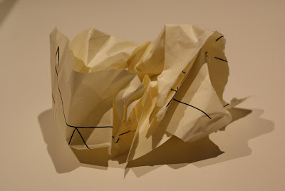
what surprised me the most about this design once i started researching it was its inspiration. just as my current design studio project is based around the geometry of crumpled paper, this design was based around the geometry of origami! i guess this design strengthens the idea that strong, interesting architecture doesn't need to be based on the grandest of ideas- rather it may be inspired by simpler ideas worked on methodically, with a creative process. 

Tuesday, April 28, 2009

trace

heres a quick trace i did in my ever so boring art + society lecture (done in illustrator), again geometry could form the basis of my design studio project... 


Sunday, April 26, 2009

garbology

feast your eyes on the thirty-odd spices of garbage i've managed to discover & catalog. these magnificently rare (who am i kidding- they are as common as bob... my room is always a mess) specimens all naturally inhabit my bedroom floor collecting dust as an instinctual mean for survival. as intentionally photographed i'm sure you shall see some very interesting shapes and shadows! 


Friday, April 24, 2009

les bains des docks


Image

The aquatic complex 
Les Bains des Docks  (animation here), designed by the 2008 Prtizker-prize winning architect Jean Nouvel has just opened in the historical Port of Le Havre. Inspired by the Roman thermal baths, the 5,000-square-metre complex offers an eerily beautiful atmosphere of tranquility with the fantastic play of natural light soothing the eyes, the masterful acoustics pleasing the ears, and the pools and treatment areas taking care of the rest of the body.

Image

Although the main “colour” of the complex is white, each section’s distinct atmosphere and hue is created by flowing water curtains, colour walls, and various textures and surface treatments. Each pool – lap-pool, children’s pool, whirlpools – is designed, shaped and lit to create a unique “private space” for its specific users. These seemingly enclosed areas help minimize echoing and sound carriage – an annoying aspect of most aquatic centres - as do the varying-height floors and ceilings, and the acoustic false ceilings. Saunas, a hammam, cold and hot baths, and a spa area with hydro-massage and aquagym areas complete the atmosphere of pampering and care. An external lagoon makes the summer use of the complex even more appealing.

Image

The Docks in the south end of the ancient port city of Le Havre are the oldest docks in France. The area is under massive revitalization with the goal of making this a leisure, culture and shopping neighborhood. When completed, the area will include residences, a large park, a tropical greenhouse, cinemas, bowling alleys and a shopping center, plus a Nouvel-designed Sea and Sustainable Development Centre to be completed in 2011. The Sea Centre will be a showcase of shipping and sailing – exploring their economic and industrial significance as well as their environmental impact on coasts and estuaries. It will be a 120-meter-high metallic structure dominating the port and it will include exhibit areas, an aquarium, a meteorological station and a restaurant with panoramic, 360-degree views of Port of Le Havre.

Image

Nouvel’s well-known public buildings literally span the world from New York to Reykjavik, Dubai, Soul and Tangiers. Recent interesting buildings include the bright-red research center for the maker of brakes for luxury cars, Brembo, in Italy. 
NouveI's masterpiece for La Philharmonie de Paris will open in 2012. 

Image
credits again to the cool hunter, this post personally caught my attention due to its similarities with the proposed design for the tapei performing arts centre i posted about a few weeks back (see post done in april 'getting sidetracked...'). difference is this space shall be constructed!